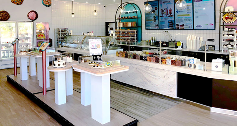
The store layout is the foundation of a successful retail experience. It controls customer flow, showcases merchandise, and increases sales. Choosing a layout that will fit the products and space your business needs is essential. You should also consider the type of customers you want to attract.
Store Fixtures
Practical store fixtures are the foundation of a retail space that attracts and keeps customers engaged. Whether used as merchandise displays or for creating dimension, store fixtures help retailers create visually appealing, functional, and adaptable spaces that support their business goals. For example, forced-path layouts can direct shoppers on a predetermined route through a store and maximize inventory control. This design also promotes impulse purchases by drawing the customer’s line of sight to product displays and other merchandise throughout the store. However, the forced-path design can create dead-ends that frustrate shoppers trying to reach a specific destination or purchase a particular item. To avoid this, a better option is to use a free-flow layout. This type of store layout is common in clothing stores, grocery markets, and specialty food outlets. The merchandise in these store aisles is grouped into semi-separate areas with walls, merchandise displays, and other fixed fixtures. This allows for a more fluid shopping experience and provides greater flexibility to accommodate seasonal shifts.
Lighting
How you light your store plays a critical role in your retail design. Too dim and your store will look dingy and make it hard to read labels; too bright and your store will be uncomfortable for customers. When choosing fixtures for your store, consider what ambiance you want to create and whether any items require special attention. For example, if you want to accentuate the quality of your products, fixtures made of authentic materials that lend a premium feel will help. Observe customer flow in your store to determine how people typically move through the space. For instance, shoppers look to their right as they enter a store, so you might place new products and displays there. You can also use eye-catching, high-impact fixtures like product demos to slow customer flow and attract attention. Also known as speed bumps, these eye-catching elements are fantastic for encouraging customer engagement and increasing sales.
Signage
Efficient store layouts provide customers with a comfortable and familiar experience while optimizing inventory management for retail stores. This process uses merchandising tools and other store design elements to manage customer flow, reduce stockouts and optimize staff utilization. Retailers use different store layout planning techniques to highlight popular merchandise and entice shoppers to browse the entire product selection. For example, retailers can boost sales by using speed bumps eye-catching, high-impact displays strategically placed in primary paths or aisles to slow down customer flow and draw attention to new products or promotions. A forced-path layout which directs customers on a predetermined route through the store can be practical, especially for furniture and home furnishings stores. However, this store layout can also overwhelm customers with a specific purchase in mind and create a sterile and uninspiring environment. Efficient store layouts must be adapted to meet seasonal demands and shifts in consumer trends.
Floor Plan
A retail store layout is critical in brick-and-mortar product engagement, sales, and customer lifetime value. It also influences product placement, merchandise selection, and a store’s look and feel. Large or small, most stores use one of the five-floor plan options: grid, loop, free-flow/mixed, diagonal, and forced path. Each has its benefits and drawbacks for specific types of retailers. For example, a mixed floor plan uses geometric shelves to display the majority of inventory while using angular displays to highlight more premium products. It can be an effective strategy for luxury stores that want to balance product categories while managing customer flow. A good floor plan should align with how customers move through your space naturally. This prevents discomfort and provides a pleasant shopping experience. It also makes it easy for customers to find the checkout area. This helps reduce cart abandonment and supports click-and-collect orders.


